Breadman - Delivering Delicious Pieces of Heaven
Case Study - Mobile App


The Brief
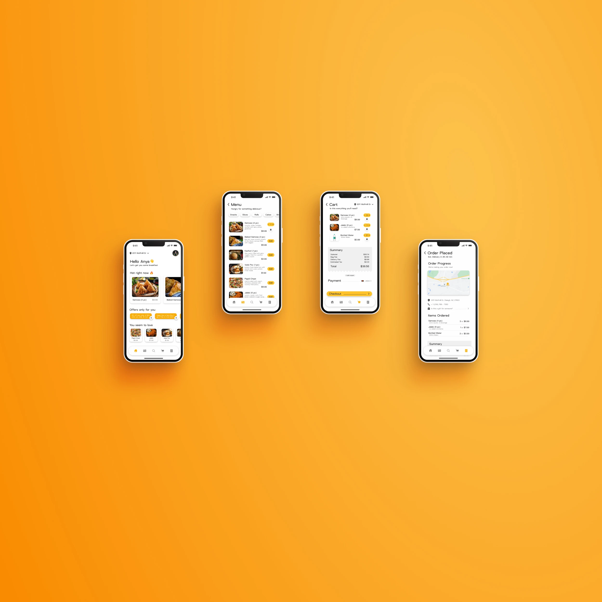
Breadman is a simple, clean and easy-to-use food ordering app that aims to simplify finding and ordering affordable meals for everyone. The app focuses on providing users with an easy-on-the-eyes, seamless experience which prioritizes minimalistic design and an intuitive UI to ensure a quick, painless and pleasant journey from the menu to the checkout. This case study explores how Breadman achieves these goals and the benefits users get from its features.
The Process
Objectives
Streamline the meal ordering process
Offer handy, helpful personalized recommendations
Forego any dark patterns
Improve UX using minimal design and intuitive UI
User Research
To generate design ideas for Breadman, I conducted user research by interviewing users of other food delivery apps. I gathered insights on their needs, pain points, and expectations. Based on that, I created user personas, sketch ideas, and user flows. This helped me design solutions that were intuitive and user-friendly.
I also evaluated the usability of Breadman’s design and features and performed a competitor analysis to identify areas of improvement and differentiation in my design.
The main user pain points discovered in the research process were:
Users feeling manipulated by dark patterns
The apps/websites being cluttered with ads and promotions
Misleading information about deals and discounts
Visually overwhelming UI
Key Features
Personalized recommendations: The app analyzes user preferences and past orders to suggest quick-add items based on time of day and location
Empowering UX: It gives the power back to the user, employing transparent and supportive elements that enhance the user flow
Minimal and Clean Design: The app is built on minimal design philosphy which ensures a clean, clutter-free and beautiful interface that aids quick and easy navigation. It focuses on simplicity, reducing distracting elements, which enhances user satisfaction.
Design Ideation
I began the design process by sketching wireframes by hand to determine the app’s elements based on gathered research data. Then, I used Figma to create my digital wireframes. I established a design system that would convey the brand’s identity by choosing a clear, modern and fun typography and a consistent color palette for the app. The next step was to produce low-fidelity wireframes for smooth navigation, user-friendly layouts and later move on to high-fidelity wireframes and prototypes with seamless transitions and a responsive design.


The Results
Breadman’s commitment to a nice clean minimal design, intuitive UI, responsive and supportive UX has proven very effective in delivering users a streamlined and easy meal ordering experience. By being laser-focused on user needs and researched pain points, Breadman has successfully differentiated itself from competitors and is poised to become a major player in the food delivery app market.